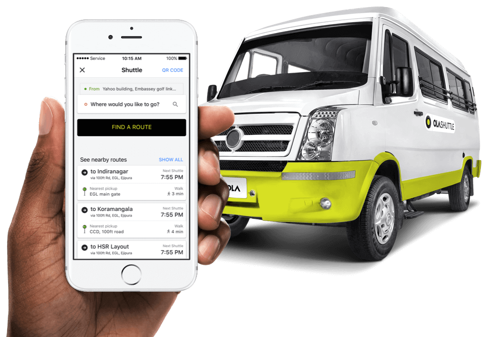
Ola Shuttle
Helping daily commuters reach their destination stress-free
The problem
Daily commute in India is a challenge where existing transportation systems are already running beyond their capacity. People go through rigmarole of catching different types of transportation mediums to get to their destinations.
It’s easy for users to feel overwhelmed while switching between multiple transportation mediums. When coupled with the inconvenience caused due to delays, overfilled buses and no place to sit it becomes stressful and reduces productivity.
My role
Ola Shuttle is built for daily commuters. I studied existing transportation system and mapped out a user journey of potential consumers to identify their pain points and figure out what success means to them. This helped me in setting up meetings with stakeholders and understand how business will help address those concerns and what success means for business.
I then regularly made end to end mockups and tested them with daily commuters to get clarity. After which I showed best possible approach to stakeholders and senior designers and took feedback. This iterative approach helped me ship out a world-class product which is now being used by millions of users daily.
It took us 3 months to roll out the MVP and another month to improve upon our product. I was the sole designer on this and currently looking after it.
User study
Our users are those who travel to work on a daily basis, occasionally using multiple modes of transportation.
Here are a few questions that we asked our users to chart down their existing user journey:
- How do you identify your nearest pickup point?
- If you have a destination in mind, how do you decide which bus to take?
- Do you have any concerns while travelling?
- Do you care about getting a seat in the bus?
- How do you explore different routes?
- Do you care about the quality of transportation you are travelling in?
The above set of questions helped us map the current user journey and its challenges.
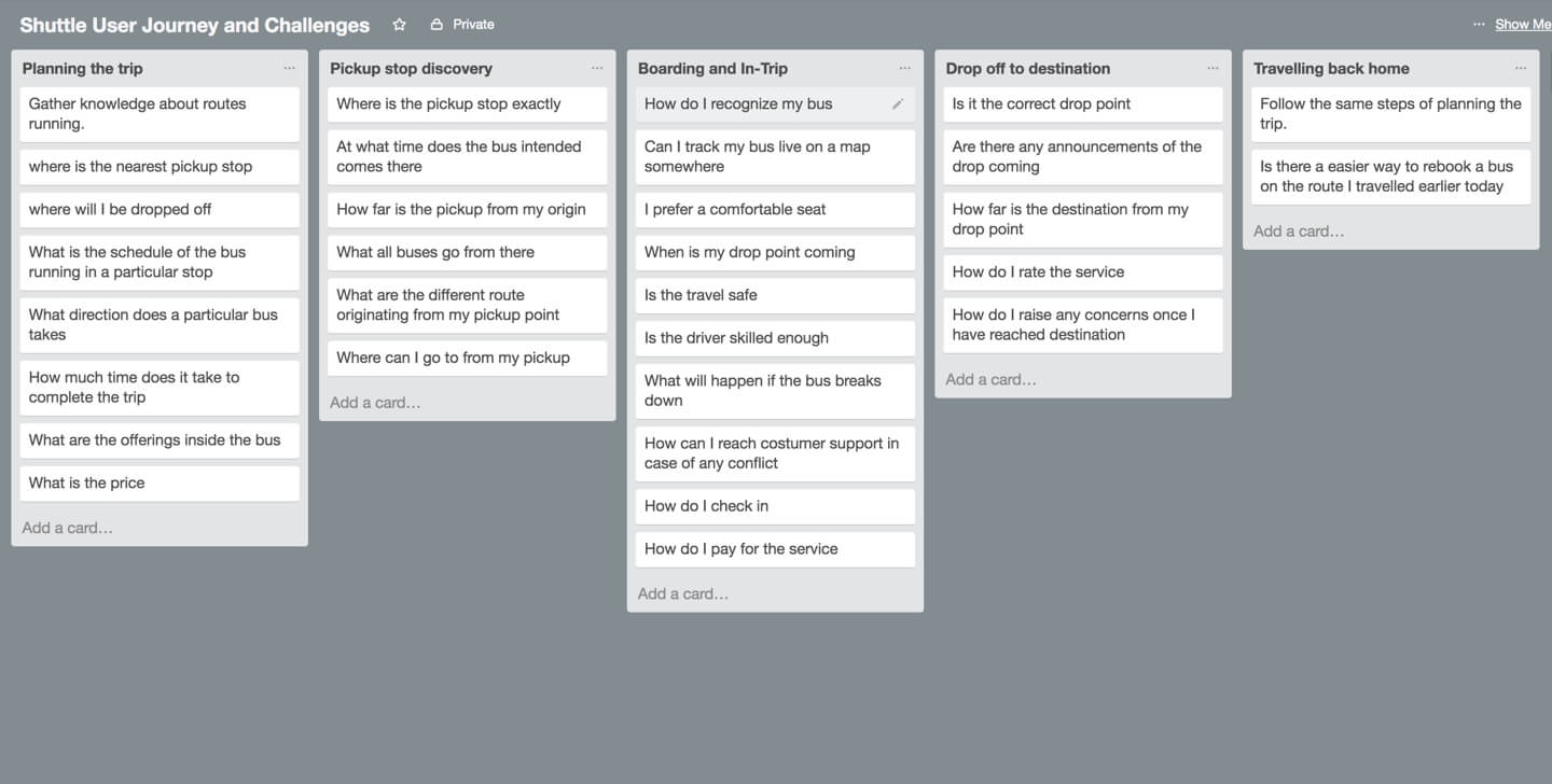
Top user concerns during the journey
- When is the bus arriving at my stop?
- Where is the nearest pickup?
- Where will I be dropped off?
- Will I get a seat?
- What is the schedule of the bus?
- When will I reach my destination?
What are the desired outcomes
- Reduce anxiety about bus location
- Provide real time tracking
- Guarantee a seat
- Exploration of routes and pickup/drop off points
- Provide comfortable travel with air-conditioned buses
- Make sure users reach their destination safely
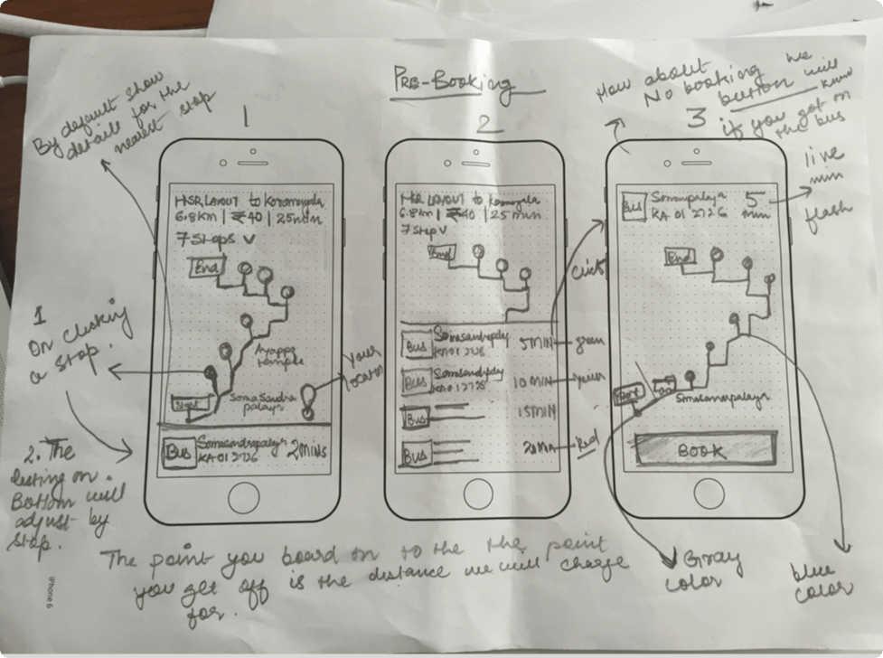
We obsessed over making Shuttle easy and intuitive to use. To come up with a clear vision and flow was a challenge, and to make sure we hadn’t left out any idea, we went through twenty end to end prototypes of the app, exploring different flows thoroughly and picking out the best solution to make the final product.
UX process
When you work on a product like Shuttle, that has to be built from scratch, there are thousands of ideas floating and you have to make a well informed decision, articulate and justify it too. It's a critical situation, because the success of the product depends on the direction you take it into.
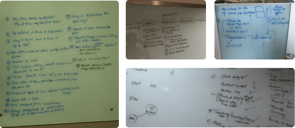
Prototype
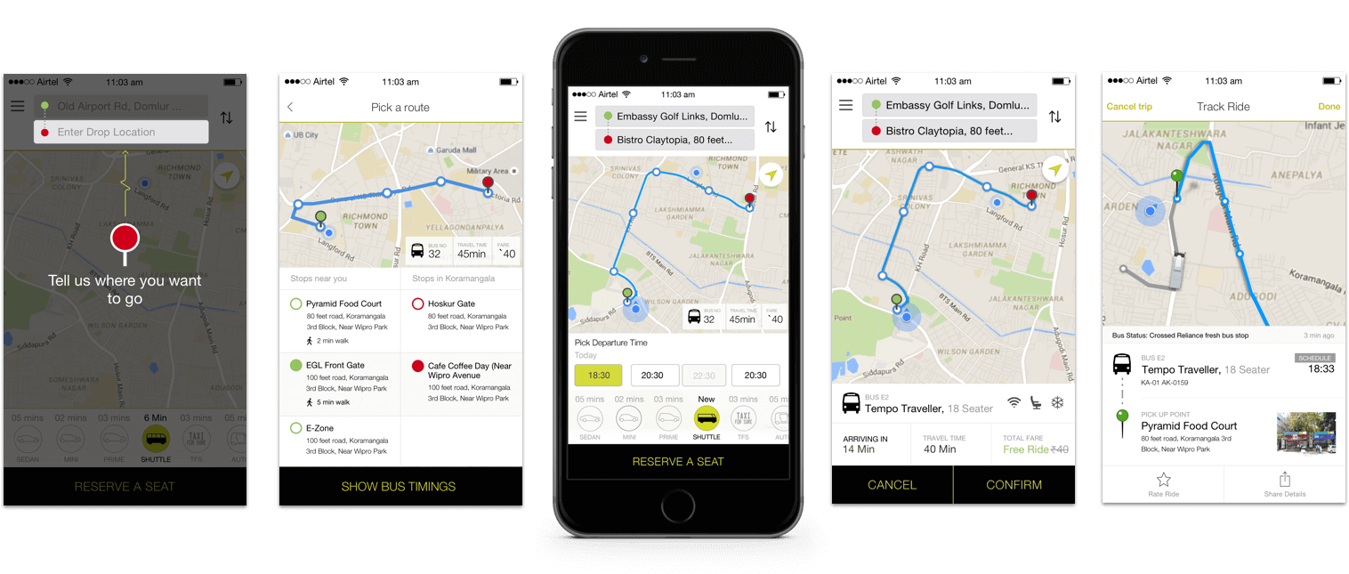
We obsessed on making a perfect flow for our users, this is one of them divided into different tasks that a user will go through while interacting with the product.
Shuttle V.1, MVP
After spending countless hours on building end to end flows, debating over thousands of design challenges, we came to a consensus. We went ahead with the easiest flow possible, one that helps user book quickly, track the bus and get on it effortlessly. It takes a lot to build a product. Building a service that would go on to serve a billion people was nerve wracking.
We were proud to ship out a well thought product with the following features.
- Route discovery
- Stop selection
- Schedule of the buses
- Route directions
- Comfortable seats
- A/C in the shuttle
- Tracking of the shuttle in real time
- Information of the pickup and drop stops
- Ability for users to buy passes and travel without making a booking daily
Usability testing
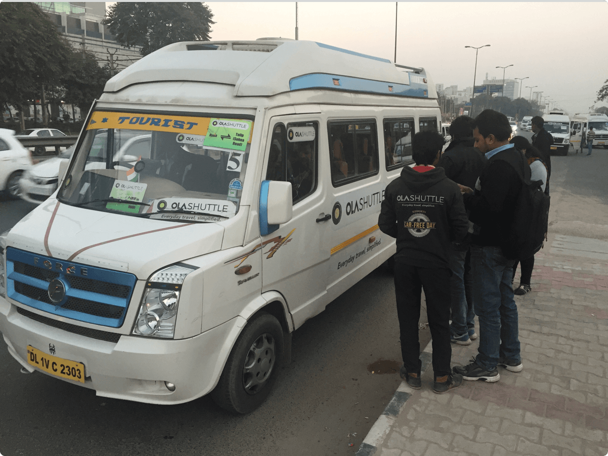
We wanted to make sure that the on-ground experience was as good as the in-app experience. The entire journey had four important states. We wanted to do a usability testing around those states and ask the right questions. We flew down to Gurgaon and did usability testing. We observed how users were interacting with the service.
The results weren’t obvious, there was a lot of scope for improvement.


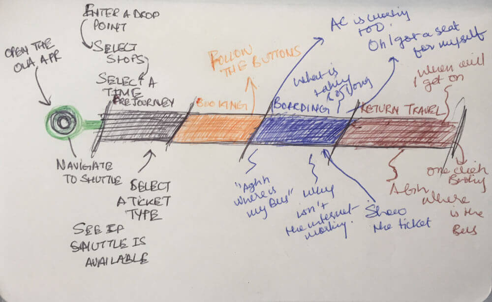
Problems identified
- On a bad network users had to wait for the rate and review screen to come if they haven't rated yet, hence making booking process slow
- Too many messages upon booking, 4 different types - 1 email & 3 text messages
- Meta search was out of place. Users were unable to search for popular stops, ex - 'Snapdeal' which is a popular stop was showing a different result
- There was no feedback on tapping certain actions on the screen
- Most people were travelling daily and booking a ticket daily was adding a task to their daily routine
- On-spot booking users didn't care about the map, they knew their spots and wanted the system to match their speed
- Discovery of different routes running in the city was an issue
- Introductory screens didn't help, people went straight ahead into booking without noticing them
- On slow speed networks app failed to respond
Our on-ground experience helped us understand our product better. There were a lot of shortcomings that needed to be fixed. With our assumptions and findings, we went ahead, articulated a flow, and shipped version 2.
A product that works for people - v2
All of our efforts helped us build a world class product which is helping millions of users reach their destinations stress-free. Here is how it evolved from a product that was built on assumptions to a product that is well-informed and future-proof.

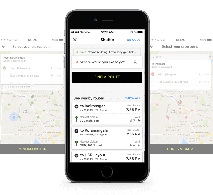
1. Pre-Journey
Most of our users were booking an Ola shuttle from the pickup stop and were not concerned about maps while booking a shuttle. Therefore, we removed the map and asked a simple question: “Where do you want to go?”
Additionally, we solved the problem for route discovery. Earlier people couldn’t discover different routes. Now, they are able to see all nearby routes along with when the next shuttle is arriving and the nearest stop they can board from.
2. Booking
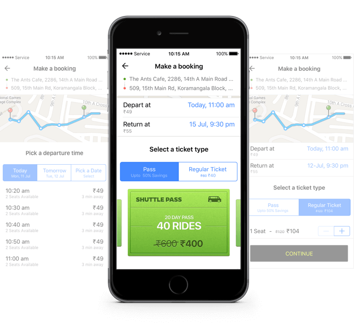
Users can easily pick their desired type of ticket. They can go for a regular ticket or a pass. To motivate users to go for the pass we had the pricing comparison upfront with the value they will get out of it. Upon scrolling down they can see the map as well.
3. Boarding
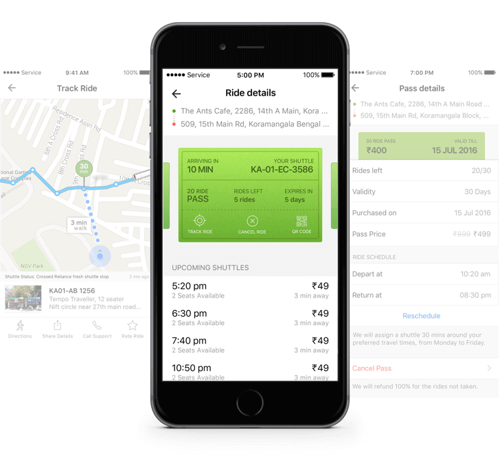
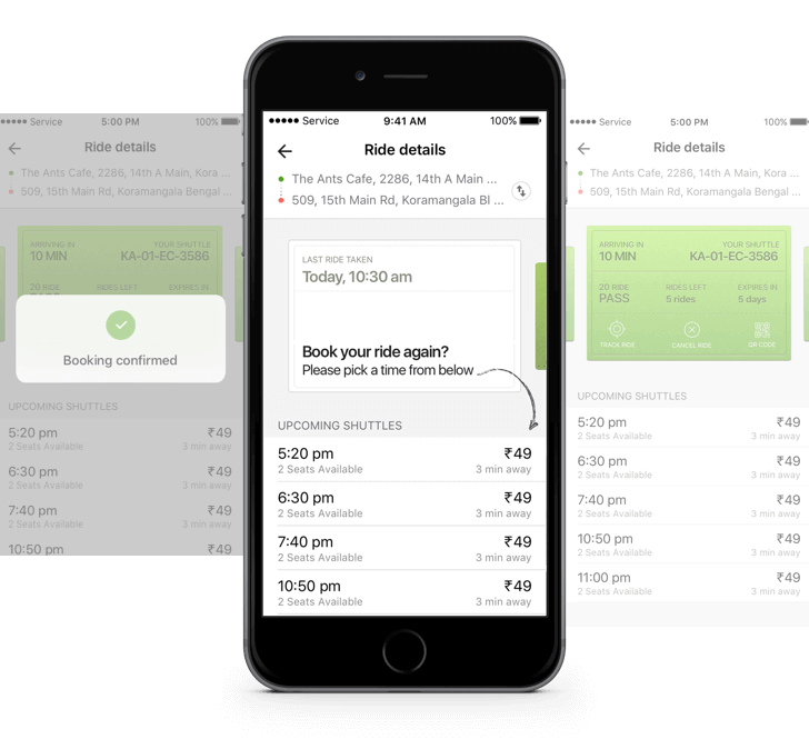
We realized people wanted the shuttle to be flexible, i.e if they can’t make it to their scheduled shuttle, then there should be a convenient way to see the upcoming shuttle and re-schedule the ride.
Also it should be easy enough for users to cancel, track and scan their ticket upon boarding the shuttle, hence, we added the actions right on their pass.
4. Return travel
We realized people wanted the shuttle to be flexible, i.e if they can’t make it to their scheduled shuttle, then there should be a convenient way to see the upcoming shuttle and re-schedule the ride.
Also it should be easy enough for users to cancel, track and scan their ticket upon boarding the shuttle, hence, we added the actions right on their pass.
Business Impact
Shuttle created a great business market for Ola. It is an important part of the team as it helped to acquire a new segment of customers. The cab market did not address the problems of connecting Metro feeder routes for daily commuters.
Shuttle created a market of its own and and solved daily commute for millions of users. Currently operational in 6 cities.

User Impact
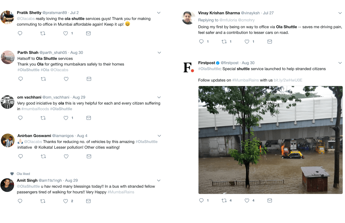
Our users wanted a cheaper and reliable option that is comfortable and helps boost their productivity. In Gurgaon where traffic is beyond limits, Ola Shuttle helped relieve traffic congestion as more and more customers left their own transportation mediums and travelled with us making commute easier for everyone.
The Team Behind Ola Shuttle
- Akash Soti, Product Designer
- Aditya Anand, Product Manager
- Harsha Ravichandaran, Chief Data Scientist
- Sundeep Sahani, VP product
- Sunit Singh, SVP Design
- Prashant Jain, Design Director
