Sticky header navigation
The header stays pinned while the iPhone X flow moves, giving the user a stable wayfinding anchor. The home-return transition uses spatial continuity and clear easing so movement feels connected instead of abrupt.
The header stays pinned while the iPhone X flow moves, giving the user a stable wayfinding anchor. The home-return transition uses spatial continuity and clear easing so movement feels connected instead of abrupt.
The progress-bar animation was tuned for a 60-second wait window: first 35% in 6 seconds with easeInOut, next 35% in 12 seconds with easeOut, next 20% in 12 seconds with easeInOut, and the final 10% in 30 seconds with linear motion and shimmer. This changed a static waiting screen into feedback that felt alive, fast, and actively working for the rider, reflecting motion-design principles of perceived performance, continuity, easing, progressive feedback, and reassurance; ride cancellations reduced by 70%.

The upgrade moment uses a short confetti burst to signal success without blocking the rider. The motion is intentionally brief: enough reward to confirm the state change, then quick recovery back to the task.

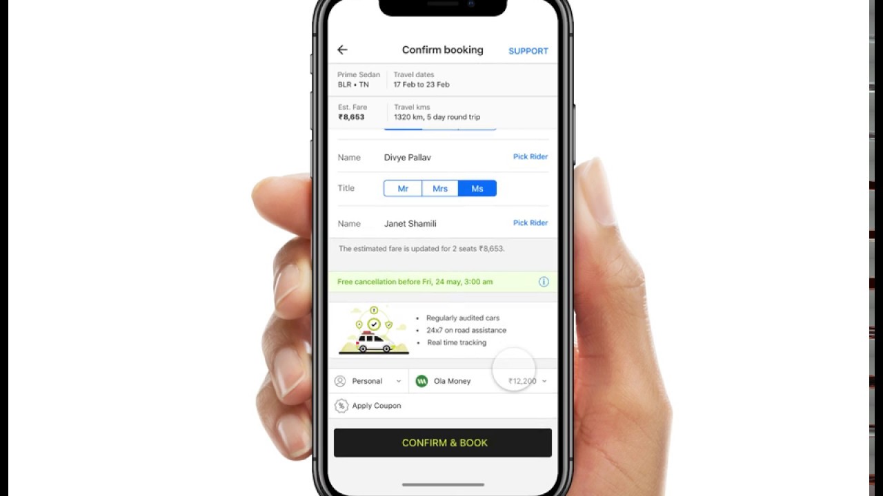
The rate card transition stages pricing information in a controlled reveal instead of dropping the full card at once. The animation uses hierarchy, timing, and containment so the user can register the fare change without losing context.

The bell animation tests how much motion is enough to be noticed without feeling noisy. A compact anticipation-and-settle movement makes the alert feel responsive while keeping attention on the surrounding UI.

The music prototype explores browsing, player controls, and screen-to-screen continuity in an iOS-style flow. Motion is used to preserve context between list, detail, and playback states so the app feels coherent.

The multi-screen Framer flow checks whether navigation, transitions, and state changes hold together across an end-to-end journey. It focuses on rhythm, orientation, and reducing the cognitive cost of moving between screens.

The shimmer prototype turns loading into visible system feedback. Instead of leaving the user on a blank or frozen state, the animated placeholder communicates progress, reduces perceived wait time, and protects layout stability.

The peak-pricing meter converts a price surge into a visual scale so the rider can understand intensity at a glance. The motion gives the pricing state a clear direction and makes the change feel explainable instead of arbitrary.

The ride-completion rating flow makes feedback fast to give and satisfying to finish. Micro-interactions reinforce selection, reduce hesitation, and close the journey with a clear sense of completion.
