Punchh mobile app redesign
A case study
Business Goal
Enable people to redeem and earn rewards in the most obvious way possible when they pay for their meal.
Make life easier for users. Users already have so much to handle when they enter a restaurant. The Punchh app should be built in a way so that the most essential things, punching and redeeming restaurant cards, are fast and straightforward.
For us it’s important to realise that we are just there to help the user get his free meal. We don’t want to force design to make the user feel it’s presence. It’s better if the user doesn’t even notice the design and work his way to his goal, FREE MEAL!
The problem
Imagine a user walking into his favorite restaurant. All he wants is to enjoy his favorite meal without taking care of his coupon codes and stuff. As a designer it’s our responsibility that we see the world through our customers eyes and understand their problems as they experience them. People carry their phone at all times, and it’s a great opportunity to address and solve a problem.
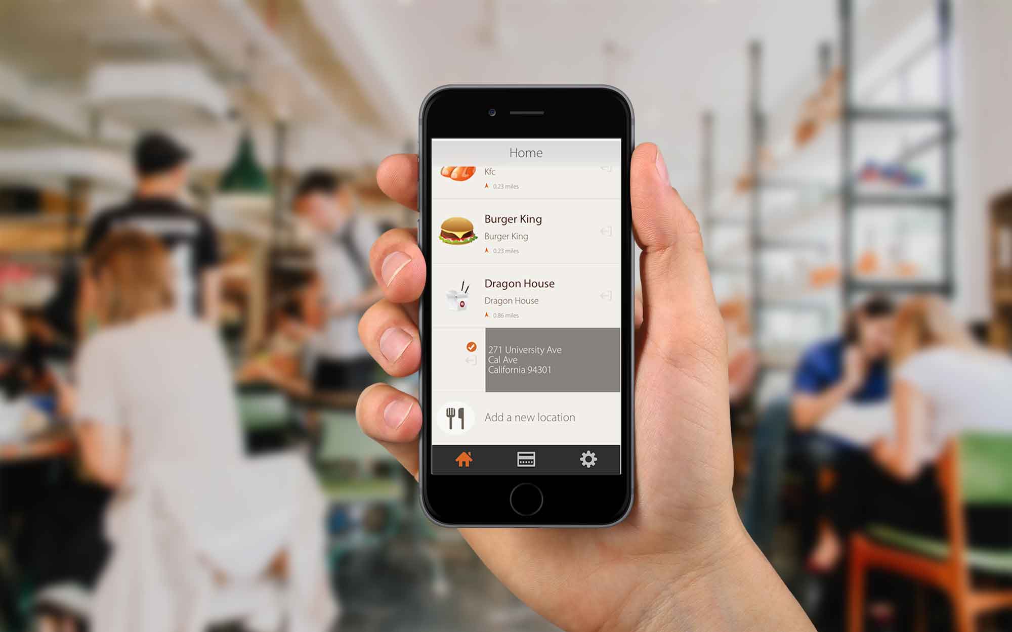
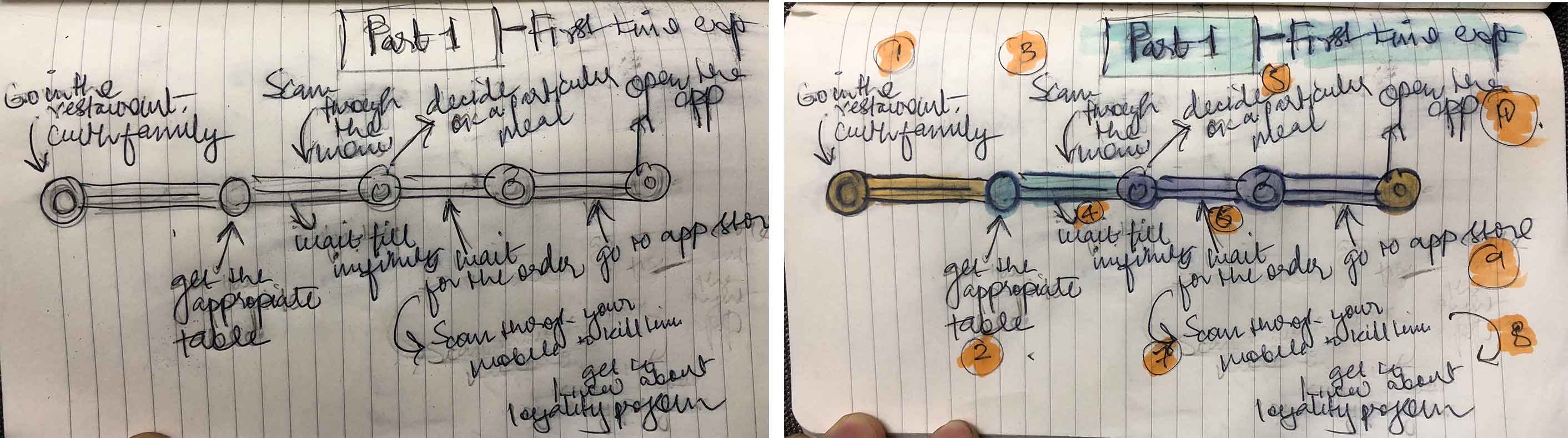
Existing user journey
Imagine a user walking into his favorite restaurant. All he wants is to enjoy his favorite meal without taking care of his coupon codes and stuff. As a designer it’s our responsibility that we see the world through our customers eyes and understand their problems as they experience them. People carry their phone at all times, and it’s a great opportunity to address and solve a problem.
Solution
The main purpose is quick redemptions and punching.
People have already so much to handle when they walk into a restaurant, they are looking at the menu deciding what they’re going to eat and it’s normally the time when people socialize and chat with their loved ones.
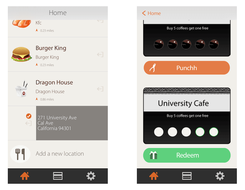
Punchh takes out the clutter by storing customers loved restaurants coupon cards and rewarding them as they visit.Who doesn’t love a little love back for being a regular customer!
Emotional and Fun
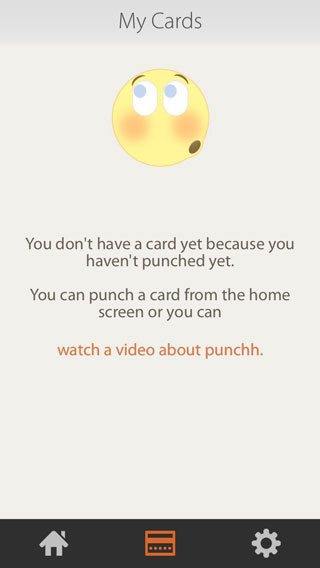
At first when people start collecting cards the first screen they see is a nice smiley and a link to how Punchh works.
Less but better-because it concentrates on the essential aspects, and the product is not burdened with inessentials. Back to purity, back to simplicity! People instantly like simple, well structured, neat and symmetric things.
People like being in control of things, and emotions link them with that feeling.
What we essentially desired designing Punchh is to introduce fun and emotions. We didn’t want our users to stare at an empty screen. If something is coming blank it should be helpful even then too.
The way forward
We want to take our users' experience forward with meaningful interactions and subtle animations. A little more fun and excitement will make users open the app again, and when they do that, they will visit more often to start punching and earn rewards.
![]()