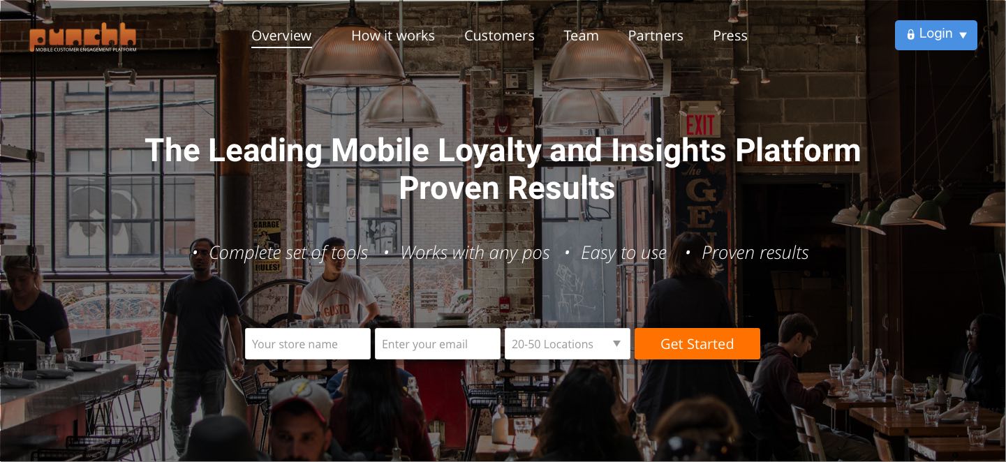
Punchh website redesign
A design overhaul
Business Brief
Establish brand presence and make it easier for the users to understand what Punchh can do for their business
Make life easier for users. Users already have so much to handle when they enter a restaurant. The Punchh app should be built in a way so that the most essential things, punching and redeeming restaurant cards, are fast and straightforward.
My role
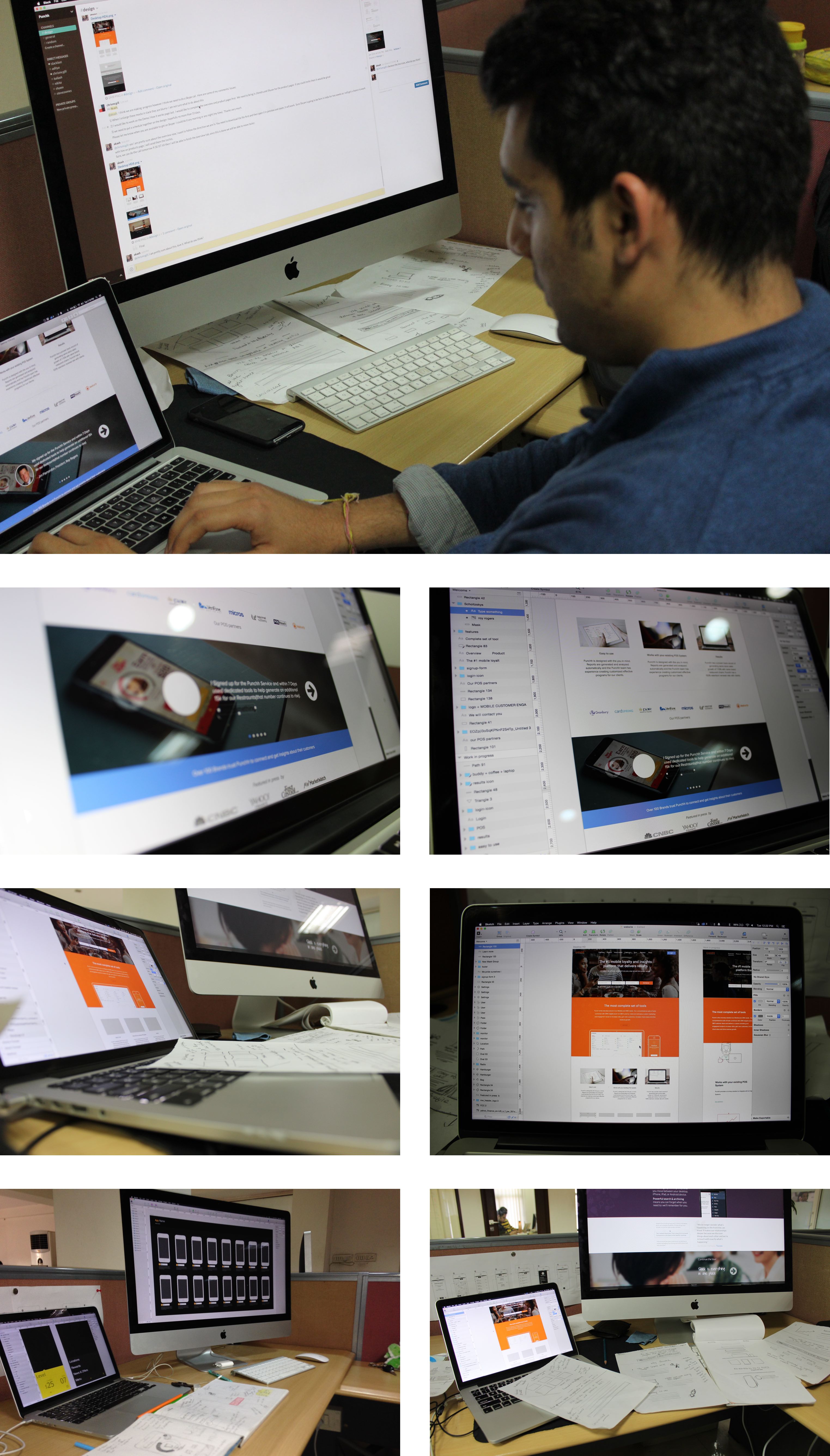
I started out by studying the existing website to identify areas for improvement. Being a designer at Punchh, I knew the most important selling points of Punchh and how the system works. I started by creating wireframes and sketches, took feedback at regular intervals from stakeholders, and later hand-coded the entire thing into a responsive website.
I used HAML, SASS and Ruby on Rails to make my code DRY, readable and easy for collaboration.
Understand, explore, articulate, repeat
more coming soon...

