
Amazon · 2023
Alexa Smart Basket for groceries
From a 30–60 minute Fresh shop down to one tap
Overview
Alexa Smart Basket was designed to cut the time it takes to order groceries on Amazon Fresh. The minimum lovable product shipped on the Amazon app in India, on Android, as a widget on the Fresh storefront. It mixed purchase history with popular, on-deal, and trending items, pre-checked the list, and let customers add the basket in one tap.
- ~30 min
- Typical weekly search-and-add loop we designed to collapse
- 12
- Pre-selected items for customers with a purchase history
- 1 tap
- To add the basket, with a matching one-tap undo
My role
As Senior UX Designer, I led the end-to-end UX and UI. I aligned US and India stakeholders on this MLP, prototyped the Fresh widget, and presented the longer vision to VP-level leadership. A design workshop in New York set a three-year north star; this widget was the first slice we could ship.
The problem
Fresh customers in India were mostly planned shoppers: weekly or monthly rations, not a single forgotten item. A typical order was 8–10 products. Building it meant opening the app, searching, adding, and repeating until the mental list was gone. That loop took about 30 to 60 minutes, on a chore they already did every week.
The people we designed for already knew how to shop online. They liked a deal, but they did not have time to hunt for one. Smart Basket had to make the next cart feel curated, then get out of the way.
North star, then the MLP
Before we committed to a widget, we asked what grocery would look like if Alexa actually built the basket. Low-fidelity flows put the value proposition up front: build the cart automatically from search, add the whole list in one tap, speak the order, and leave a cart already waiting with a way to tell Alexa whether it got the list right. Those ideas were meant to travel across devices, not only the phone.
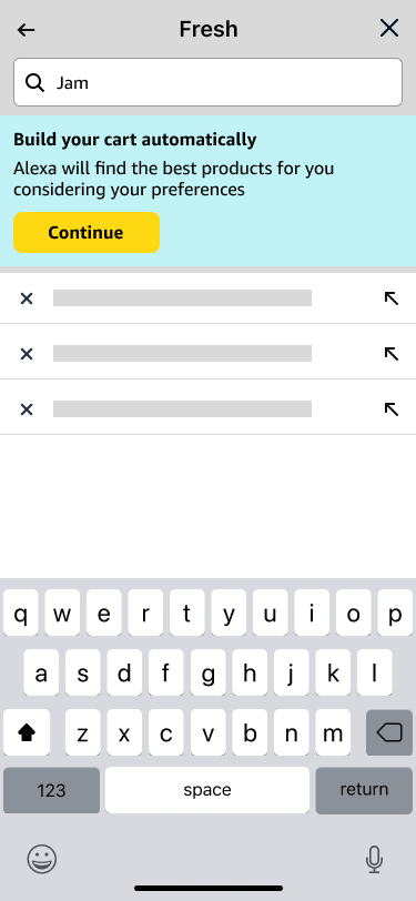
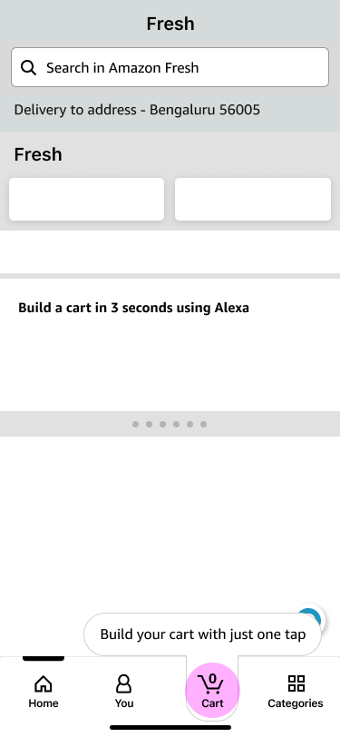
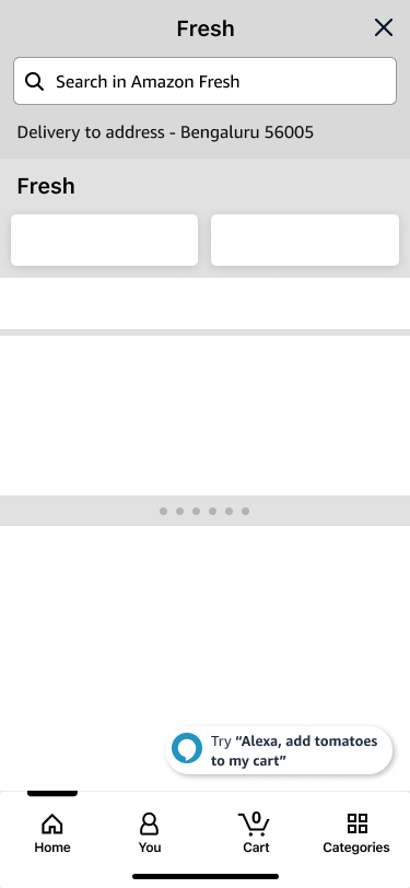
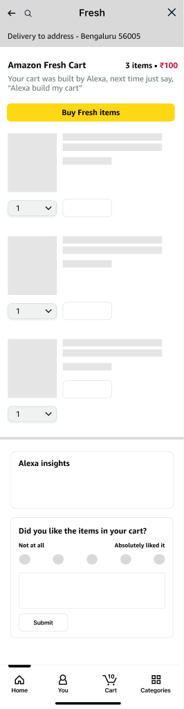
The MLP pulled that ambition onto Fresh itself. Weekly shoppers already landed on the storefront. A widget there could use the same prediction, stay flexible enough to uncheck items, and still feel like someone had picked the list for them.
The shipped widget
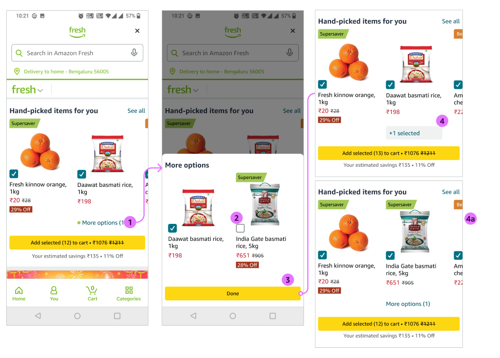
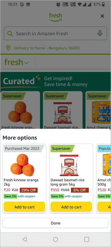
The handoff was a compact Curated module on Fresh: personalized items, badge-aware More options, and add without leaving the storefront. Header copy settled on Curated with the line Get inspired! Save time & money, because the widget had to feel carefully chosen, not like another carousel of tiles.
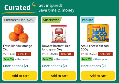
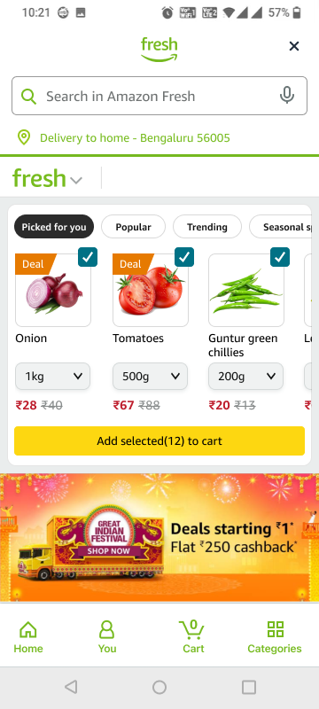
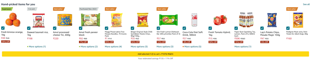
On the storefront the module sat in the Fresh gateway, above the rest of the page. Customers with a purchase history saw about twelve products already selected. See all opened a vertical list so they could scan with more confidence than a horizontal carousel alone allowed.
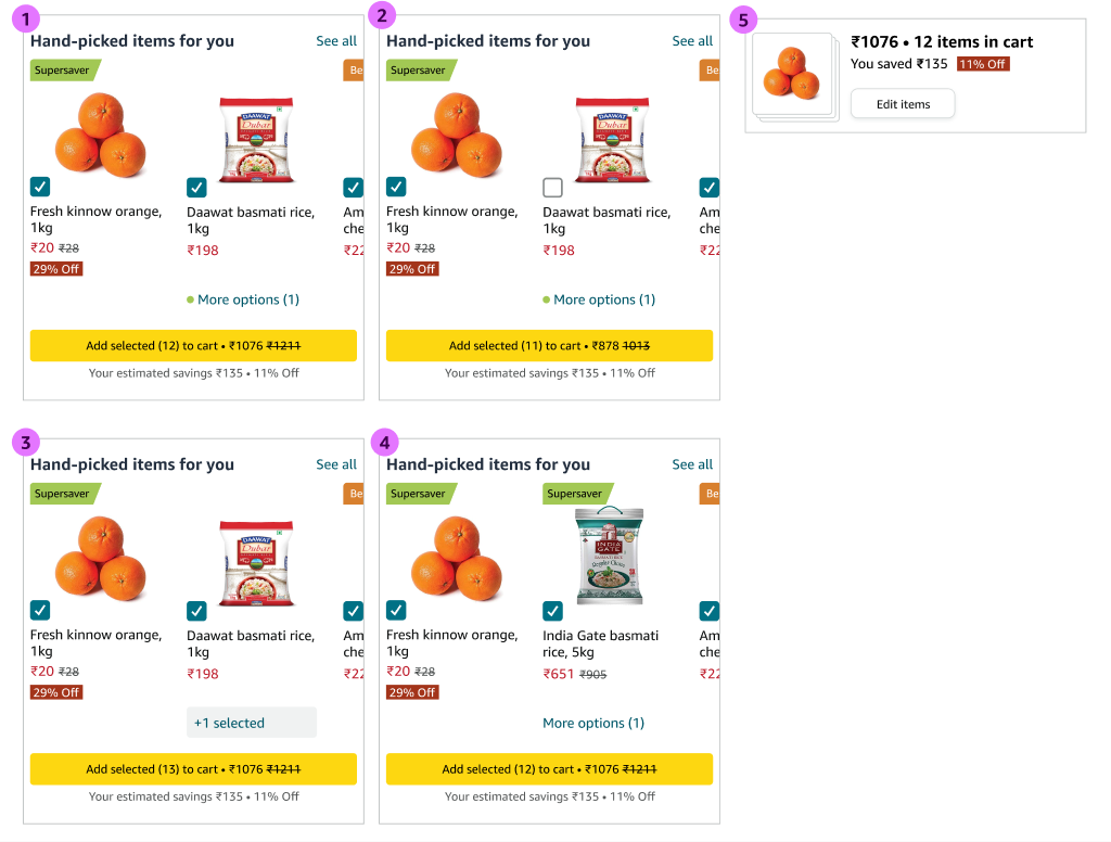
The primary button always said how many items were selected and what they would cost. Savings sat under the CTA, because the widget was also a deal surface, not only a reorder list.
Decisions in the widget
1. Pre-checked, because we assumed the prediction was the list
The design assumed most suggested items, including quantities, were what the customer came to buy in that session. Pre-checking them made add-all the default. Unchecking had to be just as easy, so a miss never felt like a trap.
2. More options, with a hint that a better deal is inside
If someone usually bought 1 kg of their usual rice, but a larger pack saved money, we did not auto-switch the brand. We showed More options, and used the same colored dots as Fresh badges so a green mark could mean a Supersaver was waiting in the sheet.
Substitutes started unchecked. Customers could replace the original or add both. After Done, the tile read +1 selected; unchecking the original promoted the alternate into its place. That both-items path mattered for shelf-stable goods, a large part of the India assortment. A better deal from another brand should never silently replace the one they already trust.
3. After add, collapse into a summary we could undo
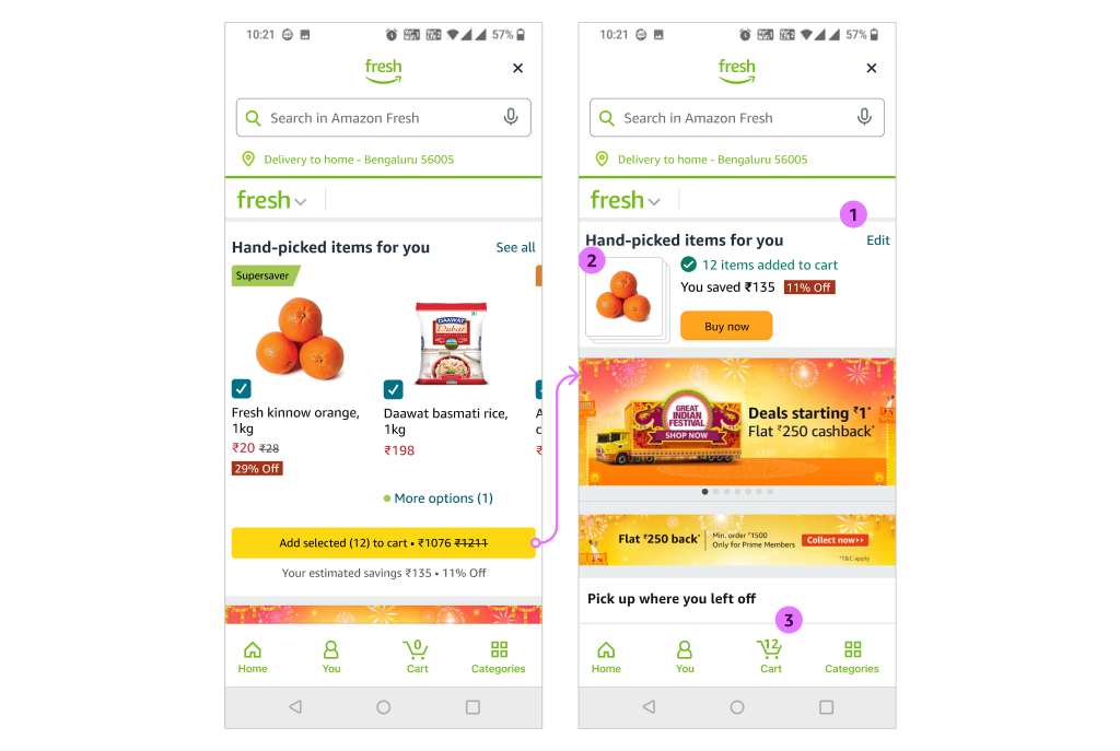
Bulk add collapsed the widget into a stack of product images, the item count, and the savings. Edit took the items back out of the cart and restored the widget with the last selection intact, so a mis-tap did not mean deleting twelve lines in the cart. Buy now jumped to address and slot. The bottom nav cart count updated with what the widget had added.
4. The widget has to know what is already in the cart
If a product from the list was already in the cart, it showed an in-cart badge and arrived unchecked, so Add selected would not double the item. After checkout the widget reset. While the customer was still in the session, moving around the app reserved their state instead of wiping the cart.
5. Pack size lives in the sheet, not a stepper on every card
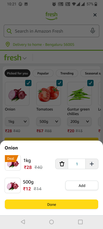
Tapping an item opened substitutes, including other pack sizes and deals. We kept quantity off the faceout. On Fresh, a stepper appears after something is already in the cart. Showing one by default next to a checkbox would have made people wonder whether the groceries were in the cart yet.
Alternates we did not ship
India Fresh design asked whether the widget could stay put after add, with only an inline success message. That was cheaper to build. We kept the collapse. Adding many items in one click needed a bulk undo; a vanishing toast was easy to miss, and a second tap would have dumped another full set into the cart. The summary was also the only honest place for Buy now.
We also tried quantity steppers on every card. They crowded the faceout, implied the items were already in the cart, and fought the bet that recommendations would predict quantity well enough for the first add. Quantity still lived in the cart after the bulk action, and in the More options sheet when pack size was the real question.
Outcome
Smart Basket launched as the first step in that multi-year grocery vision: a high-confidence widget for customers we could already predict, measured against conversion, operations, and basket size. Public numbers for the experiment were never released. The job of the MLP was to take a 30–60 minute planned shop and make the next twelve items a review, not a search.